Whistler’s pastels: what they tell us about conservation

This blog was written by Lilith Charlet, a student of History of Art in the School of Culture and Creative Arts, University of Glasgow, 2020.

In 1879, the Fine Art Society of London commissioned Whistler to produce a set of twelve etchings in Venice. During his trip, Whistler fell in love with the Italian city and ended up staying fourteen months instead of the three allocated at first. During this period, he produced about a hundred magnificent pastels, along with the required etchings. It was not the first time he explored the medium, but his prior experiences were a lot more varied and often consisted of “quick sketches of beautiful women.”[1] Although he did draw and paint some landscapes before, he turned fully to landscape pastels in Venice. There he started to develop a profoundly unique and personal use of pastels, exploiting the brown paper as a basis for his works. As a result, his landscapes, such as The Riva – Sunset; Red and Gold  (fig. 1) possess a hazy colourful atmosphere, the medium application revealing the grainy texture of the paper and integrating its colour in the composition.

venice yale

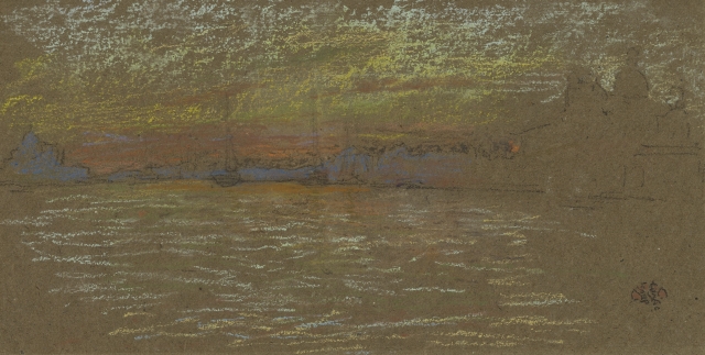
Fig. 1: James Abbott McNeil Whistler, The Riva – Sunset; red and gold, 1880. Chalk and pastel on paper, 140 x 267mm. Yale University Art Gallery, 1966.9.27.

At the end of the eighteenth century, “pastel [became] increasingly denigrated in the critical literature as undemanding and feminine in contrast to the stronger, more masculine technique of oil painting.”2 Consequently, we had to wait until the second part of the nineteenth-century to see a resurgence in pastel painting.3 Whistler was part of this late nineteenth-century pastel revival and his pastel productions, especially the ones he brought home from Venice, form a major part of his work. Excited by the Venice pastels, Thomas Way wrote a letter to Whistler in May 1880 in which he expresses his concerns about the transport of such a fragile medium:

“I too, hope much from the pastels … Meanwhile (again) I have been very anxious about the careful transit of these same for I know how soon they are injured. Can you have a dozen slight deal boxes made the exact size of the paper, each to hold a limited number of the pastorals dash – with tissue between each – and no room for shaking and consequent rubbing … Thus you would be saved the risk of there being over hauled on the homeward journey.”4

For anyone who has ever used this medium, the issue of fixating, conserving and transporting pastels will be obvious. Their fragility, beautifully described by Diderot as “the precious powder … which falls off as easily as scales from a butterfly’s wings,”5 poses an obvious challenge to their adequate preservation. Museum visitors usually admire exhibited works of art, without always knowing the impressive efforts of museum staff working in the shadow to put up such an exhibition. This includes for instance the participation of curators, conservators, museum educators, tour guides, marketing teams and so on. With this post, I would like to highlight the technical aspect of conserving pastels such as Whistler’s. Without this crucial work, the public would not be able to enjoy the beauty of these artworks. To do so, I interviewed Professor Joyce H Townsend, Senior Conservation Scientist at the Tate and Honorary Professor of History of Art at Glasgow University, about the challenge of preserving such fragile pieces of art.6

Venice old bridge

Fig. 2: James Abbott McNeill Whistler, The Old Bridge – Winter, 1879. Chalk and pastel on paper, 191 x 259 mm. The Hunterian, University of Glasgow, GLAHA 46080.

The Hunterian Museum owns four of Whistler’s Venice pastels: The Old Bridge – Winter (fig. 2), Nocturne: ships and gondolas, Venice (fig. 3), Sunset; red and gold – Salute (fig. 4) and Salute – Sundown (fig. 5). Before getting to the exhibition space, these pastels would have to be transported from their usual storerooms (Kelvinhall in the case of Glasgow University’s Hunterian’s collections). This transport is one of the major issue when caring for pastel paintings. When I visited the collections in Kelvinhall to see these four pastels, it was the first thing the conservator mentioned. She recounted, laughing, how stressful it had been when they had to transport them. With the powdered texture so easily detaching from the paper, pastels are more delicate to transport than other types of works. Professor Townsend explained to me that they would usually be transported “flat or with the case at 45 degrees from flat.” However, damage is not only caused by the work’s position. Indeed, the vibration caused by the road, even when buffered with adequate transport boxes and rugs, still damages the paintings.7 Leila Sauvage, Bill Wei and Marcias Martinez recently researched a way to predict how much vibrations a pastel can take before being extensively damaged.8 Interestingly, they discovered that “damage in pastel paintings due to vibration is cumulative.”9 This implies that a painting has a certain ‘quota’ of travels before “damage becomes unacceptable.”10

Venice nocturne p

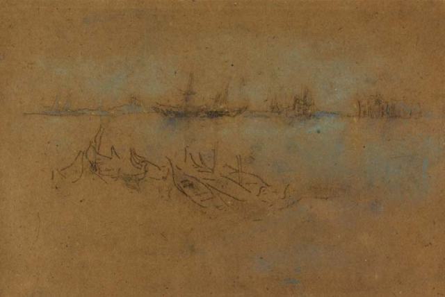
Fig. 3: James Abbott McNeill Whistler, Nocturne: ships and gondolas, Venice, 1880. Chalk and pastel on paper, 200 x 299 mm. The Hunterian, University of Glasgow, GLAHA 46082.

It is interesting, from a theoretical point of view, because it reveals the tension between exhibition and conservation, maybe more than with other mediums. We do want to show these works, and museums today insist on the importance of the transmission of knowledge. It is then crucial for these works to be exhibited and accessible to the public. At the same time, the more they will move, the more they will be damaged, and we also want to protect them from further deterioration. They have an important role to play in future historical research and they will allow historians to gain a better understanding of our past. It seems like a complex paradox. Museums work within that space, within that tension between transmission and conservation, and strive at finding the right balance – but it is not always an easy task.

venice sunset red

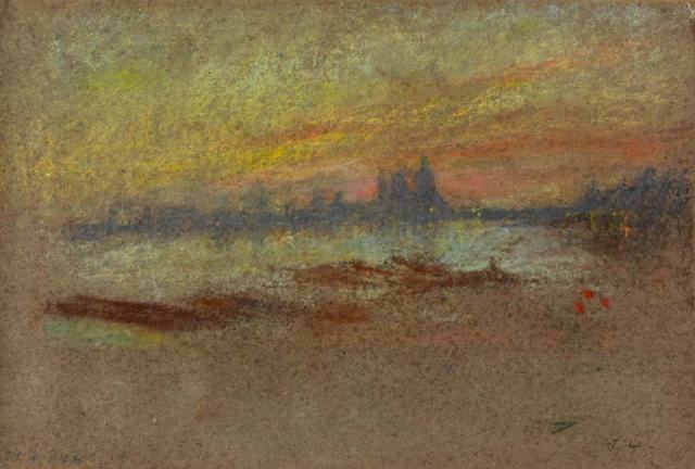
Fig. 4: James Abbott McNeill Whistler, Sunset; red and gold – Salute, 1880. Chalk and pastel on paper, 202 x 300 mm. The Hunterian, University of Glasgow, GLAHA 46084.

When speaking about the difficulties of transporting pastels, Professor Townsend also explained that “museums used to tape glass in frames to hold it in case of breakage when it travelled, but the taping and tape removal [could] generate static and cause immediate damage.” She explored this issue in depth in 1993 with Heather Norville-Day and Timothy Green.11 At the time, they needed to transport some of Degas’s pastels for an exhibition. To prevent static charges and further deterioration of the works, they decided to use glass glazing and to tape it to “limit damage should breakage occur.”12 This choice, made to protect the work, actually led to the development of static charges that attracted the fragile pastel powder to the glazing. This demonstrates how delicate these artworks are and how complicated their manipulation is. Any small detail, as specific as taping, could be decisive in protecting or harming the work.

venice salute sundown

Fig. 5: James Abbott McNeill Whistler, Salute – Sundown, 1880. Chalk and pastel on paper, 202 x 268 mm. The Hunterian, University of Glasgow, GLAHA 46083.

The conservator’s work is constantly made of such crucial choices. For Professor Townsend, “if the pastel is in good condition and in its original frame, the decision whether to unframe it is the hardest one of all, because the frame provides such important and rare historical evidence.” For artists, however, the choice seems to rely more on whether or not to use a fixative on their pastels. Historically, “framing pastels paintings behind a protective sheet of glass remained [until the mid-eighteenth century] the recommended way to preserve the fragile image.”13 When the interest shifted from glass to fixatives, multiple engineers and inventors of the eighteenth century, including for instance La Tour and Loriot in France, claimed to have found the easiest and most efficient way to fic the medium. “One challenge was identifying a suitable substance; another was finding an appropriate method of application.”14 Until recently, sprays did not exist. Hence many different techniques were used: floating on the surface of water, blowing through a straw or sprinkling with a brush.15 Very different from today’s chemical fixatives, artists of the eighteenth and nineteenth century would have used alcohol, fish glue, egg white or Arabic gum.16 Applying a fixative is an irreversible process, which explains why conservators and artists are usually weary of it; it is indeed difficult to predict how it will impact the aspect of the painting and how it will age.

According to Professor Townsend’s observations, Whistler’s pastels at the Hunterian Museum do not seem fixed. Sunset; red and gold – Salute (fig. 4), however, appears to be covered it a multitude of darker spots. In an informal discussion, one of the Hunterian conservator and Professor Margaret MacDonald explained that this might have been the result of a sprayed application of a fixative in the past. The impact it had on the work (which still remains absolutely stunning) emphasises how important such decisions can be. Not only can fixatives have massive repercussions on the works, but even analysing them is greatly complicated by the fact that it any sampling is excessively delicate.17 On the other hand, Sauvage, Wei and Martinez’s research suggests that fixatives might improve pastel paintings’ resistance to transport vibrations.18 Although they do insist “that this does not imply that one should use a fixative to protect pastel paintings from vibrations,”19 it shows how much more there is to learn about the use of fixatives. In short, “at present … conservators simply do not have sufficient information to make a judgement – positive or negative – regarding the effectiveness of fixatives.”20

In this blog post, I hope to have highlighted the complex position of conservators, especially when confronted with works as fragile as Whistler’s pastels. The difficult choices they have to make often touch upon wider philosophical questions – is preservation more important than exhibition? Can (and should) we always fight against the influence of time? How much can we modify a work for the sake of its conservation? Pastels in particular, because of their extreme fragility, push conservation to its limits, reaffirming the importance of such issues. Moreover, conservation is located at the intersection of chemistry, engineering and art history; it blurs the limit between traditionally divided fields. Usually restricted to the collections storerooms and laboratories, it unfortunately remains far from the lay public, even when so much is at stake in the shadow of exhibitions.

venice sunset red

NOTES:

[1] Robert H. Getscher, James Abbott McNeill Whistler: pastels (New York: George Braziller, 1991), 22.

[2] Thea Burns, The Invention of Pastel Painting (London: Archetype Publications Ltd., 2007), 153.

[3] Freya Spoor, “Revival of pastel in late nineteenth-century Britain: the transience of a modern medium” (PhD diss., University of Edinburgh, 2017).

[4] Letter from Thomas Way to Whistler, The Correspondence of James McNeill Whistler (online),  https://www.whistler.arts.gla.ac.uk/correspondence, GUW 06082, accessed April 13, 2020.

[5] Denis Diderot, Diderot on Art, ed. and trans. J. Goodman, vol. 1 (New Haven: Yale University Pres, 1995), 77.

[6] This discussion dated from February 24, 2020.

[7] Marion F Mecklenburg, Art in Transit: Studies in the transport of paintings, 1st edn (Washington and London: National Gallery of Art, 1991).

[8] Leila Sauvage, W. (Bill) Wei and Marcias Martinez, “When Conservation Meets Engineering: Predicting the Damaging Effects of Vibrations on Pastel Paintings,” Studies in Conservation, vol.63, sup 1 (2018): 418-420.

[9] Ibid. 420.

[10] Ibid.

[11] Heather Norville-Day, Joyce H Townsend and Timothy Greer, “Degas pastels: Problems with transport and examination and analysis of materials,” The Conservator, vol. 17, no. 1 (1993): 46-55.

[12] Ibid. 47.

[13] Burns, The Invention, 145.

[14] Burns, The Invention, 149.

[15] Margaret Holben Ellis, “The Shifting Function of Artists’ Fixatives,” Journal of the American Institute for Conservation, vol. 35, no. 3 (Autumn-Winter, 1996): 242.

[16] Information obtained through correspondence with Professor Townsend, Holben Ellis, “Artists’ Fixatives” and Burn, The Invention.

[17] Information obtained through correspondence with Professor Townsend.

[18] Heather Norville-Day et al., “When Conservation Meets Engineering,” 419.

[19] Ibid. 420.

[20] Holben Ellis, “Artists’ Fixatives,” 251.

Posted in Uncategorized | Leave a comment

Looking East : Japan transcribed

The author of this blog is Nora Aubrey, a student in the School of Culture and Creative Arts, University of Glasgow.

When Japan opened itself to the West in 1859, convinced by Commodore Matthew C. Perry and his American fleet to sign diplomatic agreements with the US, it had a major impact on the world – politically, economically and artistically.[1] As Japan and its art became readily accessible and intelligible to the West for the first time in almost 250 years,[2] a trend occurred : Japonisme. This was term coined by the French art critic Philippe Burty in 1872 that defines the taste for Japanese things, and which strongly influenced various artists, particularly James McNeill Whistler.

The fascination for exotic objects, coming from this distant land and culture, quickly took over Europe. Asian screens, fans and blue and white porcelain could be found in domestic interiors, and women’s fashion was strongly influenced by the Japanese kimono. “Even the way the fashionable Parisienne stood and moved between 1860 and 1900 was, so to speak, imported from Japan.” [3]

Monet fanClaude Monet, La Japonaise (Camille Monet in Japanese Costume), 1876. Oil on canvas, 231.8 x 142.3 cm. Museum of Fine Arts, Boston.

Many artworks produced during the second half of the nineteenth century illustrate the exotic appeal of the Orient. Looking at Whistler’s Caprice in Purple and Gold: The Golden Screen, a young woman ‘à la mode’ (French for fashionable) is fascinated by Japanese prints. This picture is part of a series in which European models find themselves surrounded by Japanese props and wearing kimono-like garments, a practice that can be questioned.


SCREEN

James McNeill Whistler, Caprice in Purple and Gold: The Golden Screen, 1864. Oil on wood panel, 50.2 x 68.7 cm. Freer Gallery of Art, Washington, DC

This blog’s aim is to explore the appropriation of Japan’s art and its material culture and how this Japanese influence was used and translated into a Western context in Whistler’s work. I wish to open up a reflection upon this phenomenon, which brings up issues around cultural appropriation and plagiarism, but remains a form of homage to Japanese art.

As Wichmann stated : “the study of Japonisme has led to some highly varied and surprising conclusions, and it continues to be a fruitful subject to the present day”[4] and I believe it is still relevant to explore this trend and its different instances, especially in Whistler’s work.

Japonisme can indeed be looked at not just as one phenomenon, but several.[5] If it had an impact on material culture in people’s occidental lives and in the work of many artists, who experimented with Asian props in order to stage exotic settings, Japonisme also revolutionised European visual arts in the nineteenth century.

In the midst of the cultural crisis that Western modern society was facing, Japonisme acted as “the engine of evolution.”[6] The admiration for details in Japanese art confronted machine production, which had become a threat to quality.[7] As a by-product of this reaction against industrialization and Victorian eclecticism,[8] European art found in Japanese art what it was longing for : a reorientation at a moment of stylistic crisis.[9]

This shift in attitude is similar to previous rediscoveries of the past, the Renaissance and Neoclassicism coming to mind, which sustained innovation and originality.[10] However, this rebirth was fuelled by inspiration coming from an unfamiliar place, rather than a lost time. This encounter with a new place and its foreign culture inspired imagination and fantasy, a filter through which the Japanese nation, this remote ‘other,’ was certainly looked at, but more importantly : was admired.

GLAHA 18630.750x750 kiyonaga

Torii KIiyonaga, Winter scene with ladies on a balcony and in the garden, 1784-95, colour wood cut, Whistler collection, The Hunterian, GLAHA 18630 

Japonisme was not only about borrowing exotic objects and playing with costumes, but more significantly about engaging with the artistic work and skills of respected Japanese masters, who introduced a softer and simpler use of colour as well as what appeared to a curious Western eye as disruptive compositions. Looking at Whistler’s work, alongside Japanese prints, one can notice the strong influence they had on his imagination and in what manner they renewed his perception of subject matter and style.

Freer Gallery of Art, F1892.23a-b

‘Variations in Flesh Colour and Green – The Balcony’

James McNeill Whistler, Variations in Flesh Colour and Green – The Balcony, 1864-1870; additions 1870-1879. Oil on wood panel, 61.4 × 48.5 cm. Freer Gallery of Art, Washington DC.

kIYONAGA 12

Torii Kiyonaga, The Twelve Months in the Southern Quarter (Minami jûni kô): The Sixth Month-Enjoying the Cool in a Teahouse, c. 1785. Color woodblock print, 39.1 x 52 cm. Art Institute of Chicago.

We can for instance notice the striking similarity between one of Kiyonaga’s prints from the late eighteenth century and Whistler’s Variations in Flesh Colour and Green – The Balcony, which could almost be considered an imitation of the former. However, one should see it rather as a free reinterpretation of Kyonaga’s composition and figures.[12]


Sketch for 'The Balcony

The Hunterian


J. McN. Whistler, Sketch for ‘The Balcony’, c. 1867-70. Oil on wood, 61.0 x 48.2 cm.The Hunterian, University of Glasgow

Whistler developed a personal ingenuity in borrowing elements of Japanese traditional art and integrating them within his own artistic practice; he cultivated a conscious appropriation of Japanese pictorial arrangements and principles in his work, as his selective approach to those prints suggests[13]. In Variations in Flesh Colour and Green, and especially in the related sketch, Whistler puts particular emphasis on posture and gesture, as well as the use of specific garments, which were crucial in Japan.[14]

Japonisme, as Whistler recognised its decorative potential, was not mere inspiration, but it also revealed one of the most recognisable aspects of his work : his love for harmony. Disregarding the traditional division between fine arts and crafts – which was never tolerated in Japanese culture where craftsmen, artists and public lived in the unitary space of a truly artistic culture[15] – Whistler stood at the beginning of a movement that gradually “brought the arts back together.”[16]

This harmony, emphasized by his musical titles, is based on careful arrangements of colours, inviting the audience to contemplate his thoughtful permutations. In a letter to Fantin-Latour, Whistler celebrates the Japanese people’s understanding of harmony, not seeking contrast but on the contrary, repetition.[17]

What defines Whistler’s work as we know it is in fact Japanese.

lAMPLIGHT

James McNeill Whistler, Harmony in Red Lamplight, 1886. Oil on canvas, 89.7 x 190.5 cm. The Hunterian, University of Glasgow

If Japonisme has led to the production of beautiful artworks, it is important to remain critical and explore the phenomenon’s limits.

We have witnessed a successful attempt to engage with it aesthetically, but to what extent have people, and especially artists, attempted to understand this culture?

While the extensive use of fans as props in Whistler’s artworks was representative of the accessory’s popularity, was he aware of the meaning of the fan in Japanese culture? In the Far East, the fan was not just an ornament but an attribute of metamorphosis[18] and the importance of fan painting was deeply appreciated as it offered a ‘glimpse into the everyday’ (according to a Japanese proverb).[19] Although, in nineteenth century Europe, numerous literary sources reflecting the life and thought of the East were available, it has been stated that they had little influence outside an academic circle.[20] And, for instance, the ways in which Asian fans have been used and represented in Western society, as isolated ornamental pieces, seem to overlook how such objects in Japan had a place and purpose of their own.[21]

With the power of interpretation comes the potential for misinterpretation, which is a risk that many artists – such as Whistler – have taken, to rightfully express their enthusiasm for Japanese art.

The significance of Japonisme, although controversial, should be acclaimed : as Goncourt claimed, “Japonisme brought to Europe a new sense of colour, a new decorative system, and, if you like, a poetic imagination in the invention of the object d’art, which never existed even in the most perfect medieval or Renaissance pieces.”[22] Admiring artists have learned a variety of artistic methods from Japanese art which they have translated and incorporated in their work to develop a modern style.  The changed representation of space, introduced by Japanese art, reflects a “changed world-view.”[23] Instead of imitation, Japonisme was a source for inspiration and transposition in Europe and this valuable interaction between cultures contributed to a visual revolution whose impact was remarkable.

And it is all the more important to consider the importance of Whistler’s response to and engagement with Japanese art, which had a significant impact on British art, as the American painter not only contributed to the expansion of this Japanese influence in Britain but also demonstrated how such unique motifs could be used and adapted. [24]

NOTES:

[1] Julia Meech and Gabriel P. Weisberg (eds), Japonisme comes to America: the Japanese impact on the graphic arts, 1876-1925, New York : H. N. Abrams in association with the Jane Voorhees Zimmerli Art Museum, Rutgers, the State University of New Jersey, 1990 New York, H. N. Abrams in association with the Jane Voorhees Zimmerli Art Museum, Rutgers, the State University of New Jersey, 1990, 7.

[2] ibid.

[3] Siegfried Wichmann, Japonisme: The Japanese influence of Western art since 1858, (London: Thames and Hudson, 1981), 19.

[4] Wichmann, Japonisme: The Japanese influence of Western art since 1858, 6

[5] Klaus Berger, Japonisme in Western Painting from Whistler to Matisse (Cambridge: Cambridge University Press, 1992), 4

[6]  Berger, Japonisme in Western Painting from Whistler to Matisse, 337.

[7] Ibid., 7.

[8] Meech, Japonisme comes to America, 163.

[9] Berger, Japonisme in Western Painting from Whistler to Matisse, 6.

[10] Ibid., 1.

[12] Berger, Japonisme in Western Painting from Whistler to Matisse, 40.

[13] Toshio Watanabe, ‘Eishi Prints in Whistler’s Studio? Eighteenth-Century Japanese Prints in the West before 1870’, The Burlington Magazine, vol. 128 (December, 1986), 880.

[14] Wichmann, Japonisme: The Japanese influence of Western art since 1858, 16.

[15] Berger, Japonisme in Western Painting from Whistler to Matisse, 36.

[16] Ibid., 35.

[17] 30 September – 22 November 1868: The Correspondence of James McNeill Whistler, 1855-1903, edited by Margaret F. MacDonald, Patricia de Montfort and Nigel Thorp; including The Correspondence of Anna McNeill Whistler, 1855-1880, edited by Georgia Toutziari. University of Glasgow. http://www.whistler.arts.gla.ac.uk/correspondence (GUW 11983).

[18] Wichmann, Japonisme: The Japanese influence of Western art since 1858, 165.

[19] Ibid., 166.

[20] Berger, Japonisme in Western Painting from Whistler to Matisse, 4.

[21] Ibid., 66.

[22] Edmond de Goncourt, Mémoires de la vie littéraire, Paris 1956, vol.3, 334.

[23] Berger, Japonisme in Western Painting from Whistler to Matisse, 63.

[24] Meech, Japonisme comes to America, 36.

Posted in Uncategorized | Leave a comment

Persona, Publicity and the Public Eye Whistler and the Commercial Art World

The author of this Blog is Hester Mauduit, a third year Honours student in the School of Culture and Creative Arts, University of Glasgow.

Whistler was a polarizing figure: his notoriously flamboyant personality secured him both friends and enemies, admirers and critics. He seems to have carefully shaped his image in the public eye, cultivating an exclusive circle of friends, courting controversy – sometimes actively seeking it. While he undoubtedly must have had innate qualities and impulses that caused him to act, dress and speak out as he did, this cult of the self aided him in selling his work, and he must have been fully aware of this.  Did he not stage his most controversial (and newsworthy) solo exhibitions shortly after returning from Venice, penniless and out of public favour? For his 1883 show Arrangement in White and Yellow at the Fine Art Society, for example, he redoubled his efforts in pursuing, challenging and calling out the press. All publicity was good publicity. Though this was uncommon at the time, it does not seem so strange today. In fact, museums today must employ a variety of strategies to keep visitors coming and justify their existence, which include putting on controversial or cutting-edge shows. There are other ways in which Whistler’s exhibitions are reminiscent of contemporary practice however. Kenneth John Myers has suggested that his exhibition designs heralded the rise of the white cube, both in their aesthetics and in the way in which he changed the relationship between viewer and art work. [1]

In this post, I will explore Whistler’s theories on art and how to display it, and present some thoughts on the rise of the notion of the Aesthetic, the cult of Artist, and the White Cube, hopefully showing that in his clever marketing and packaging of his work, Whistler heralded the commercial climate of the contemporary art world.

In a sentence, the characteristics of a Whistlerian exhibition design were fewer artworks, hanging ‘on the line’, restrained interior design based on carefully coordinated colour schemes, and individual parts subjected to the whole.

tumblr_m6yl5ryfuq1r70t2xo1_1280

Honoré  Daumier, The Salon of 1859, lithograph from the series L’exposition de 1859 (1859)

It is likely that he conceived of a change in exhibition practices early on in his career, for example when he displayed his work at the Paris Salon of 1859 (see the illustration above), where it was drowned among the thousands of paintings hung floor-to-ceiling. [2]

Myers suggests that he abandoned the Academies when he started painting his ‘nocturnes’ in the early 1870s, because of their subdued tones, which made them hard to light and display advantageously in traditional Salon-style hanging. [3] Some of the highly modern techniques Whistler applied to exhibition design were indirect lighting, uniform framing, large promotional banners on the façade, and the sale of specially-made catalogues. [4] It is strange to think that these were not yet common practice at the time!

Perhaps his greatest innovation however, was to create a setting in which each work could be admired individually. While Whistler held complex theories of art, in essence he meant for his work to be shown beautifully.

y178_001

James McNeill Whistler, The Peacock Room, (1876-77) featuring La Princesse du Pays de Porcelaine, oil on canvas (1863-65), reconstruction at the Freer Gallery of Art Credit: https://www.si.edu/exhibitions/the-peacock-room-comes-to-america-6230

In his biography on Whistler, Daniel E. Sutherland describes the etchings as being ‘nearly lost in this surreal world’, and this wording is significant. [7] It indicates that the overall effect of the room might have had more of an impact on the viewer than the individual works, which seems counter-productive if he was trying to sell them. In fact, reviews in various newspapers and magazines mostly discussed the installation and catalogue, rather than the etchings. [8] This is not surprising if we think about how far he departed from exhibition practices of the time.

The sharpest contrast was formed with Whistler’s spacing of the works, as opposed to frame-to-frame hanging, rather than the use of interior decoration to present them. Some scholars have noted that a result of giving each work individual space, as well as a function within the overall design of the room, was that it encouraged the visitor to move around the space and shift their viewing position. Elizabeth Prettejohn points out the ‘rhythmic alternation’ of works at the Pall Mall exhibition of 1874 at the Flemish Gallery, and explains that visitors moved back and forth in order to alternately contemplate each work and the whole wall. [9] This seems to be the way modern visitors are expected to move about a room when visiting a gallery or museum, because curators carefully choose how to sequence the works to make them tell a story or have the desired aesthetic effect on the viewer. This spacing of the works had further implications, which brings me to my next point.

In his famous Ten O’clock Lecture, Whistler declared:

Art should be independent of all clap-trap – should stand alone, and appeal to the artistic sense of eye or ear, without confounding this with emotions entirely foreign to it, as devotion, pity, love, patriotism, and the like.” [10]

In this lecture Whistler presented a line of ideas parallel to those of the Aesthetic Movement of the late nineteenth century. It is important to note that neither Whistler, nor the Aesthetes, considered him a member of the Movement. We can however credit him as an important purveyor of the idea of the Aesthetic, which values art as pure aesthetic representation, not as a representation of something else, or as a channel of moral ideas.

White Cube

Niels Borsch Jensen Gallery and Editions, Deutsche Museen, (2005) Credit: https://www.artsy.net/article/artsy-editorial-white-cube-dominate-art

In his exhibitions this idea took another form, presenting works of art as self-contained aesthetic objects worthy of individual attention. Myers passionately argues this point, and claims that Whistler’s exhibitions of the 1880s marked the transition towards the rise of the White Cube (see illustration above) in the early twentieth century.  [11] This type of exhibition design was pioneered by the Museum of Modern Art in New York, after it was remodelled in 1939 by Phillip S. Goodwin, who turned its interior into antiseptic laboratory-spaces in which the visitor was encouraged to view art as isolated specimens. [12] This separation of art from life is often seen as a typically Modernist phenomenon, but I think it is safe to say that it can be traced back half a century and found in Whistler’s ideas. The other aspect of White Cube spaces is a sense of calmness, which can also be found in Whistlerian exhibitions. Ruth E. Fine notes that some reviewers commented on the restfulness and comfort of Whistler’s spacious hang. [13] ‘Calmness’ has two effects: it creates an atmosphere of decorum and encourages according behaviour, which includes keeping your voice down and moving slowly, for the appreciation of Art. This is reminiscent of galleries or museums today, which are still spaces of high culture and of a certain social code for select audiences, who will behave appropriately.

I’d like to argue that Whistler’s exhibitions were modernist in yet another way: he made them into society events, selling works through his personality and the appeal of the controversy he created, in his dress, mannerism, interaction with the press, and social connections. This heralded the modern cult of the genius artist and the contemporary commercial art world, where the artist is revered as much as his art, and art relies heavily on social prestige to sell. Nigel Thorp explains: “Whistler attracted public attention irresistibly and inevitably. His witticisms, his dandyish presence, his colourful activities and his repeated lawsuits were guaranteed regular attention in the press. [..] No other artist conducted a personal campaign in this way.” [14] Deanna Marohn Bendix suggests that Whistler did this because of the nature of some of his work, such as his sketch-like etchings and pastels of Venice, which was small-scale and abstracted. [15] He cultivated a flamboyant persona and pursued the press, because if he and his work were talked about, it legitimized them as art of equal worth to paintings and narrative art.

In addition to notoriety, a further way to commercialise his work was to suggest that it was too revolutionary for common people to understand. This flattered those who attended the private view of Arrangement in White and Yellow, for example, complementing the colour harmony in their black or white costumes, at the artist’s request. They must have felt like they were part of an exclusive circle, because they complete the effect of the décor and because they could appreciate Whistler’s work. [16] In this context, it is interesting to examine David Park Curry’s remark that Arrangement in White and Yellow ‘captured the ethos of the Aesthetic Movement interior as a stage for presentation of an artistic self’. [17] In other words, both the artist and his guests performed artistic personae within the walls of his exhibition, and in the tradition of nineteenth century entertainment, it was a place to be seen, as well as to see. This was not the only instance in which Whistler self-consciously utilized dress. Aileen Ribeiro observes that his own impeccable style reflected his personality, [18] but we might go further and say that it projected his personality as well; it played a part in his persona and could tell people from a distance who he was and what he stood for. This, too, is common practice in the modern commercial art world. An artist must ‘look like an artist’, gallerists and critics use complex art jargon to explain the ‘meaning’ of works, and previews of exhibitions still tend to be exclusive events. This is meant to create a context in which art is talked about, therefore meaningful, and therefore saleable.

If all this sounds rather negative, it is not meant to be. It would be too simplistic to say that Whistler created controversial exhibitions for the sake of being talked about and selling his work, or that the contemporary art world is a bubble built on public image and noise. Whistler’s views as an aesthete are widely documented and seem too much a part of him to be only a construction. However, what I do want to suggest is that his innovative approach to personal publicity and presentation of his work heralded a change in the way the public consumes art. The postmodernist world of consumerism is linked closely to advertisement which functions as follows: being told to want something makes you want it and then buy it. What Whistler did was simply an early version of this practice: creating a setting in which his work was best appreciated, making people feel that appreciating it was proof of their good taste, arguing for the merit of individual abstracted works, and ensuring that he, his works, his exhibitions, and his entourage remained in the public eye.

NOTES: [1] Kenneth John Myers, Mr. Whistler’s Gallery: Pictures at an 1884 Exhibition (London: Smithsonian Institution and Scala Publishers, 2003), p. 1.

[2] Deanna Marohn Bendix, Diabolical Designs: Paintings, Interiors, and Exhibitions of James McNeill Whistler (Washington and London: Smithsonian Institution Press, 1995), p. 205.

[3] Myers, Mr. Whistler’s Gallery, p. 4.

[4] Ruth E. Fine, ed., Studies in the History of Art: James McNeill Whistler A Re-examination (Washington: National Gallery of Art, 1987), p. 67.

[5] James Mc Neill Whistler, cited in The Freer Gallery of Art, The Whistler Peacock Room (Washington: Smithsonian Institute, 1951), p. 10.

[6] Whistler to Thomas Waldo Story, 5 February 1883, GUW 09430.

[7] Daniel E. Sutherland, Whistler: A Life for Art’s Sake (New Haven and London: Yale University Press, 2014), p. 192.

 [8] Margaret F. MacDonald, Palaces in the Night: Whistler in Venice (Aldershot: Lund Humphries, 2001), p. 113.

 [9] Elizabeth Prettejohn, Art for Art’s Sake: Aestheticism in Victorian Painting (New Haven and London: Yale University Press, 2007), p. 184.

[10] Whistler to The World, 22 May 1878, GUW 13153.

[11] Myers, Mr. Whistler’s Gallery, 3.

[12] Alan Wallach, “The Museum of Modern Art: The Past’s Future,” in Art in Modern Culture: an anthology of critical texts, edited Francis Frascina and Jonathan Harris (London: Phaidon Press and the Open University), pp. 282-291 at p. 285.

[13] Fine, Studies in the History of Art, p. 79.

[14] Nigel Thorp, ed., Whistler on Art: Selected Letters and Writings of James McNeill Whistler 1849-1903 (Manchester and Glasgow: Fyfield Books in association with The Centre for Whistler Studies, 1994), p. xiii.

[15] Bendix, Diabolical Designs, p. 211.

[16] MacDonald, Palaces in the Night, p. 107.

 [17] David Park Curry, “Much in Little Space: Whistler’s White and Yellow Exhibition as an Aesthetic Movement Bell-weather,” in The Cult of Beauty: The Aesthetic Movement 1860-1900, edited Stephen Calloway and Lynn Federle Orr (London: V&A Publishing, 2012), p. 191.

[18] Aileen Ribeiro, “Fashion and Whistler,” in Whistler, Women, and Fashion, Margaret F. MacDonald, Susan Grace Galassi, and Aileen Ribeiro, with Patricia de Montford (New York, New Haven and London: Yale University Press and The Frick Collection, 2003), p. 42.

Posted in Uncategorized | Leave a comment

The Butterfly Behind the Man: Whistler’s Monogram.

The author of this blog is Polina Atabekian, a third year honours student in the School of Culture & Creative Arts, University of Glasgow.

Freer Gallery of Art, F1892.23a-b

Variations in Flesh Colour and Green – The Balcony 1864-1873 Oil on canvas. Freer Gallery of Art, Gift of Charles Lang Freer, F1892.23a-b

The lepidopterous monogram of James McNeill Whistler first made its appearance in Variations in Flesh Colour and Green: The Balcony (Freer Gallery of Art), a painting dated somewhere between 1864 and 1873: however the butterfly may have been added later – possibly for an exhibition. [1] Since then the miniature detail has sparked a massive interest across Whistler’s community.

The aim of this blog post is to investigate the famous butterfly signature that made its perch on Whistler paintings, drawings, etchings, and correspondence, and its development (in both design and meaning) over time.

La Princesse du pays de la porcelaine (1863-65, Freer Gallery of Art)  demonstrates the rather large signature that preceded the butterfly. Upon D. G. Rossetti’s unsuccessful first attempt to sell this painting, due to the collector’s objection to the large “Courbet-like” signature, Rossetti had reached out to Whistler that if he were to change the signature, the collector would agree to purchase it. After being met with a furious reaction from Whistler, the painting was eventually sold to a different collector. Nonetheless, it must have gotten Whistler thinking about whether such a large signature had a negative effect on the painting. He considered using his initials instead. The initials J.W. were eventually transformed to form a butterfly – the ‘J’ became the torso, and the ‘W’ became the wings. It is unclear what exactly inspired Whistler to opt for the famous butterfly form, although his mother, Anna Matilda Whistler had called him a “butterfly” when he was younger. [2]

In Variations in Flesh Colour and Green: The Balcony (Freer Gallery of Art), the first painting where the Whistler monogram appears, the butterfly is positioned within an oblong frame of the same colour as one of the model’s kimonos, resembling the signatures found in Japanese woodblock prints that could have served as inspiration. A further example of this format can be found in the Nocturne in Blue and Silver (1871-72, Fogg Art Museum).

Grischka Petri adds that the emergence of the butterfly signature had to do with the artist’s tactical marketing. A detail that would bring none other than its maker to mind fell perfectly in line with Whistler’s ambitions to establish his unique public image. Together with the musical titles for his pieces, the butterfly signature provided the perfect potion to woo the art market.

One might say that a butterfly only becomes a butterfly at the final stage of its metamorphosis, but not Whistler’s. The design of the butterfly would change over the following 30 years: what started out by resembling a dragonfly gradually transformed itself, rather dramatically, to acquire antennae, veins, and eventually a tail.

In the Arrangement in Grey and Black no. 2: Portrait of Thomas Carlyle (1872, Glasgow Museums) the Butterfly is shown to have been freed from its previous rectangular confinement and acquired a more convincing butterfly shape.

But just how freely did the Butterfly soar? The Pennells would recall:

It was introduced as a note of colour, as important in the picture as anything else and at times it was put in almost at the first painting to judge the effect, scraped out with the whole thing, put in again somewhere else, this repeated again and again until he got it right. We have seen many an unfinished picture with the most wonderfully finished Butterfly, because it was where Whistler wanted it.” 

The Butterfly became a significant detail, and Whistler’s emphasis on where it was placed further confirms Petri’s theory of its marketing function – it needed to be seen.

Arrangement in Flesh Colour and Black: Portrait of Theodore Duret, 
				ArtistJames McNeill Whistler,Paintings

Arrangement en couleur chair et noir: Portrait de Théodore Duret, 1883/85, Oil on canvas, Metropolitan Museum of  Art, NY., Catharine Lorillard Wolfe Collection, Wolfe Fund, 1913, 13.20

10 years after the initial appearance of the butterfly signature, in Arrangement en couleur chair et noir: Portrait de Théodore Duret (1883-1885, Metropolitan Museum of Art, NY)  the butterfly signature is executed in red, in a slight contrast to the overall tone of the painting. However, in A Grey Note: Village Street (1884, The Hunterian, University of Glasgow) the signature is shown intricately incorporated and in tone with the painting. While both of these images served to market the artist in one way or another, the higher saturation of the signature on the portrait of Théodore Duret could imply the artist’s intention to attract more commissioned portraits, whilst using the signature as both a trademark and advertisement  simultaneously.

However, was signing the painting with the butterfly simply about the marketing? An easier, recognisable way to sign a painting? Or did the butterfly carry within its wings a more intrinsic, sentimental meaning? Mortimer Menpes, one of Whistler’s faithful followers describes his time with Whistler:

“ …he (Whistler) taught me what was meant by artistic placing and balance. Indeed, Whistler very rarely placed his butterfly on a picture without first saying to me, “Now, Menpes, where do you think the butterfly is going this time?” It used to be a little joke between us, and after some months of habit I was invariably able to put my finger on the spot where the butterfly should be placed to create the balance of the picture.” [5]

It seems that Whistler’s butterfly was a detail, the intricacies of which the artist was willing to share, and his involvement of other artists working beside him shows a sentimental side to this delicate creature. Some went as far as to say that Whistler had begun to identify himself with the butterfly signature.

Several scholars referred to Whistler as the Butterfly in chapters referring to his life during the 1870s or in books regarding Whistler’s correspondence or design. What can either be an allusion to the artist’s character, or the state of his career in that moment in time, what can be said for sure is that it was in no way a reference to his lifespan!

But did Whistler see just himself behind the Butterfly? When he married Beatrice Godwin (née Philip) in 1888, his signature changed. The butterfly alighted on top of a trefoil styled to resemble her maiden name initials ‘BP’.

In a letter to Gertrude Elizabeth Campbell, Whistler speaks about the trefoil detail:

…For You know the Trixie is my ‘Luck’ – – and see how well the trefoil and the butterfly belong “ [6]

e500201_001

James McNeill Whistler and Beatrice Whistler, View from the chateau walls, Loches, 1888, Etching, The Hunterian, GLAHA 45151

On their honeymoon, Whistler had taught ‘Trixie’ how to etch, and as the years went by she had worked alongside him. View from the chateau walls, Loches (1888, The Hunterian, University of Glasgow), the only known work on which both Whistler and Beatrice collaborated, is signed with the trefoil butterfly. Even after Beatrice’s death, Whistler continued to use the trefoil in his signature format.

In later butterflies, the trefoil was always present, in the most simplest of butterflies as well as those more defined with wings and antennae. One could say the butterfly was no longer about recognizing the work as a Whistler, but rather recognizing Whistler within it.

However, these fascinating creatures were no longer used just to sign his paintings, in fact, a large proportion of his correspondence dating from after the 1870s was signed with this monogram. But something was different, the fluttering butterfly that graced us with its presence across his paintings had grown a mischievous stinging tail.

Were I too, my dear Whistler, the airy happy thing you are – the butterfly basking in the sunshine of life – flitting daintily & jauntily about for very joy & stinging for very malice.” [7]

As is mentioned in this letter from Marion Henry Spielmann, it seems that this stinging detail on the butterfly perfectly conveyed the artist’s personality in the eyes of his peers and enemies. The question remains whether this parallel was created by his surroundings and appropriated by Whistler, or deliberately implemented by the artist himself.

m1250_001

James McNeill Whistler, Butterfly , drawn for publication  in 1890, pencil with white paint on card, E. R. & J. Pennell Collection, Library of Congress, Washington, DC, ND 237/W6A2/1899a/P&P/Pennell (M.1250)

The artist’s correspondence, particularly with members of the press, became the natural habitat for the stinging-tailed butterfly, ready to strike at any moment. Over the course of forty years, Whistler compiled the correspondence between him and the press, and he didn’t hesitate to refer back to what he considered to be audacious claims towards his work. A sampling of these were published in his book The Gentle Art of Making Enemies in 1890.

In collaboration with his editor, Whistler was able to justify his aesthetic goals whilst uncovering the crude intentions of the critics and others who doubted him within the pages of this book. The omnipresence of the butterfly within the work is described by Pennell:

“They danced, laughed, mocked, stung, defied, triumphed, dropped wings over the farthing damages, spread them to fly across the Channel, and expressed every word and almost every thought.” [8]

The butterfly in this case is augmented, the wings and antennae as well as the stinging tail bent and twisted to convey a certain mood. Making its perch across the pages next to the artist’s reflections on a particular letter, Whistler fluttered into the margins and exposed the philistines, a predecessor of a present-day Twitter thread.  

Revisiting Petri’s theory of marketing intent behind the butterfly, it is possible that by signing his letters (which then got published) the same way he signed his paintings, the artist was building brand recognition of all things Whistler.

NOTES: 1. Margaret F. MacDonald, Grischka Petri, James McNeill Whistler: The paintings, a catalogue raisonné, University of Glasgow, 2014, (cat. no. YMSM 56). Pennell, Elizabeth Robins and Joseph Pennell. The Life of James McNeill Whistler, by E.R. and J. Pennell. London: Heinemann, 1908. Vol. 1, pp. 124-25.

2. GUW 06451.

3. Petri, Grischka. Arrangement in Business: The Art Markets and the Career of James McNeill Whistler. Hildesheim: Georg Olms Verlag, 2011. p. 165

4. Pennell, op. cit, p. 125.

5. Menpes, Mortimer and Dorothy Menpes. Reminiscences of Whistler. London: Charles Holme, 1903. p. 254.

6. GUW 00511.

7. Glasgow University Library, MS Whistler M102.

8. Pennell 1908, op. cit., p. 106.

GUW = The Correspondence of James McNeill Whistler, 1855-1903, edited by Margaret F. MacDonald, Patricia de Montfort and Nigel Thorp; including The Correspondence of Anna McNeill Whistler, 1855-1880, edited by Georgia Toutziari. On-line edition, University of Glasgow. http://www.whistler.arts.gla.ac.uk/correspondence

Posted in Uncategorized | Leave a comment

Whistler in Calais ‘in the midst of wind and rain’

Map of England and Wales, pen and ink on cream laid paper,
4 7/8 x 4 15/16″ (123 x 125 mm) The New York Public Library

In 1850, young James Whistler drew a map of England and gave it to his Aunt Kate in Stonington, Connecticut. It ranges from the Scottish border north of Newcastle to the Channel Islands. It ignores Scotland and the continent of Europe except for the port of Calais across the Straits of Dover. Five years later, Whistler sailed for Europe, and over the years he worked in many coastal towns in France, including Dieppe, Trouville, Boulogne, and Calais.

Calais was the destination of ferries from Dover, several times a day, the trip taking only three or four hours from Charing Cross, London. There was a good buffet at the Gare Maritime, where Whistler would wait for the train to Paris and pen letters to friends.

In September 1896 the newly widowed Whistler (his wife had died of cancer) set off via Etaples ‘along the coast to Calais and the little villages in the neighbourhood’ as he told his sister-in-law, Rosalind Birnie Philip. He was worn out and deeply depressed: ‘so tired … so blue!’ he told William Heinemann. By the 14th of September he was staying at the modest and ‘gloomy’ Hotel Meurice on the Rue de Guise, ‘in the midst of wind and rain & general depression.’ Then he asked for ‘a little package of panels … the usual grey panels, of about the medium size … about a dozen in all’ to be sent to him in Calais. He wrote further, ‘I might stay for a day or two longer – indeed I have to do so anyhow, as I have begun something that of course I must complete’. Two little known paintings (one watercolour, one oil) were probably the result.

Near Calais, watercolour and gouache on brown wove paper, 9 5/16 x 6 7/8″ (239 x 173 mm), The Lunder Collection, Colby College Museum of Art, 2013.297.

The first is the subtle and beautiful watercolour, Near Calais. Fluid, expressive brush strokes perfectly depict the greys and greens of calm seas and sky; neat little figures stand and paddle at the water’s edge, and wriggly strokes of white like lace define the wavelets by the shore.

This watercolour was bought by the New York art dealer E. G. Kennedy from Whistler immediately on his return from Calais. was taken to America and sold in that year, 1897, to a collector, Annie Burr Jennings of Fairfield, Connecticut. She lent it to the Whistler Memorial exhibition in Boston in 1904 as Near Calais but it then disappeared for many years, until it was bought by Paula and Peter Lunder and given as part of their generous gift to Colby College Museum of Art in 2013.

William Hogarth,  O the Roast Beef of Old England (‘The Gate of Calais’; https://www.royalacademy.org.uk/art-artists/work-of-art/O51679
Credit line: Royal Academy of Arts

A slight confusion over the identity of the picture sold to E. G. Kennedy arises because his firm’s account recorded ‘1 [painting]. “Outside Calais Gate” as bought from Whistler for 60 guineas on 30 July 1897. This title might seem to reference Hogarth’s O the Roast Beef of Old England (‘The Gate of Calais’) of 1848 (Tate, London), which was familiar to Whistler as a print, and which he would have known from his childhood. However, no Calais gate appears in any Whistler painting, and ‘outside’ could cover almost any subject whatsoever, so for the moment we will leave this as a curious and unsolved mystery, and move on to another Calais subject.

Green and Gold: A Shop in Calais, oil on wood, 245 x 130 mm (9 5/8 x 5 1/8″), The Hunterian, University of Glasgow, Acc. No. GLAHA 46345 (YMSM 46345)

Rosalind Birnie Philip (who was Whistler’s ward and executrix) inherited a painting of Calais and gave it, in 1935, to the University of Glasgow.

On 16 September 1896 Whistler had written to her from Calais, ‘I began a little shop here – but it was a queer hard day today & I have done no good – Perhaps I had better get at some thing else‘. On the following day he wrote that he had stayed on ‘in the hope of finishing one small shop I had begun – It would be worth while.’

Green and Gold: A Shop in Calais may well have been that shop. There is no shop sign, but there is a hint of goods in the window, and a curious asymmetrical partial swing-door giving easy access to the interior. It is very thinly painted on a small panel prepared with an off-white undercoat. The not-quite-vertical-brushstrokes of the undercoat show clearly through pale areas of yellow ochre, light greens and greys. Some of the undercoat was left unpainted and provides the base colour of the windows. A touch of pink suggests flowers – perhaps geraniums – on the balcony; a faint and rather blurred butterfly signature appears to right of them, which suggests that it was considered fit for exhibition and sale by the artist. Whistler seems to have been interested in the subtle nuances of texture on the walls, reflections in the windows, and the play of shadows in the door and windows. However, the immediate effect is of a near-abstract arrangement of rectangles. It was very rare for Whistler to paint a scene without people, and this lack of humanity enhances the cool abstraction of the composition.

At some time in 1901 or 1902 Whistler recorded that he had sold six or seven paintings to the Paris art dealer Charles Hessel or Hessele, including ‘Green shop. Calais’, which could well have been this little oil. However, there seems to have been a problem with this sale and it is likely that some of the pictures stayed with Whistler, while others seem simply to have disappeared.

Little known, and not, apparently, exhibited in Whistler’s lifetime, Green and Gold: A Shop in Calais was nevertheless framed and selected after Whistler’s death, by Miss Birnie Philip, for an exhibition of Ouvrages de Peintures, Sculpture, Dessin, Gravure, Architecture et Objets d’Art at the Société Nationale des Beaux-Arts in Paris in 1904 (cat. no. 1316) as ‘ “Vert et Gris” (Dieppe)‘. The writer and art critic Pierre Baudin described it tellingly as ‘petite façade de maison dieppoise d’une intimité discrète et accueilante.’ In other words, it was the ‘discreet and welcoming intimacy’ of the façade, and not its unpeopled abstract quality that caught the eye.

It was then exhibited in 1915 in London and in 1935 in Glasgow, on its arrival as part of Miss Birnie Philip’s spectacular gift of Whistler’s work to the University of Glasgow. Due to the terms of her gift, it cannot be exhibited elsewhere but we trust it will soon be on display again in the redesigned Hunterian galleries, a quiet and perfect little jewel.

NOTES: Quotations are from: Baudin, Pierre, ‘Les Salons de 1904: Société Nationale des Beaux-Arts, II’, Gazette des beaux-arts, vol. 31, 1904, pp. 468-82, at p. 476, and manuscripts, Whistler to Rosalind Birnie Philip, [10, 15, 16 and 17 September 1896] and [10 September 1896], Glasgow University Library, GUW #04667, #04668, #04673, and #04674; Note books [1901/1902], GUW 13662, and Whistler to William Heinemann, [14 September 1896], Library of Congress, GUW 08479. GUW =
The Correspondence of James McNeill Whistler, 1855-1903, edited by Margaret F. MacDonald, Patricia de Montfort and Nigel Thorp; including The Correspondence of Anna McNeill Whistler, 1855-1880, edited by Georgia Toutziari. On-line edition, University of Glasgow, at
http://www.whistler.arts.gla.ac.uk/correspondence

Margaret F. MacDonald, Grischka Petri, James McNeill Whistler: The paintings, a catalogue raisonné, University of Glasgow, 2014, on-line website at http://whistlerpaintings.gla.ac.uk.

Posted in Uncategorized | Leave a comment

“NORTH EAST BY EAST”: WHISTLER IN THE CHANNEL ISLANDS

Note in Blue and Opal: Jersey

Note in Blue and Opal: Jersey (1881, watercolour, Freer Gallery of Art, Gift of Charles Lang Freer, 04.83).

This lovely watercolour, with the tiny details of beaches, houses, reflections was painted with exquisite precision, and tints of delicate colour and signed with a jaunty butterfly that appears to be related to a star-fish.  The peaceful scene – undoubtedly painted under good calm conditions –  rather contradicts Whistler’s description of his experience of the Channel Islands.  He wrote to his beloved sister-in-law, Helen Whistler on 17 October:

‘I only got here on Saturday morning – after a trip – … of the wildest – … At Guernsey then I chucked up the game and went ashore – There I stayed and struggled with wind and weather – and paintboxes with that perseverance that is the peculiarity of this family, as you will know – … quite hopeless – After being whisked about on the tops of very grand rocks and nearly blown into the sea canvas and all and dragging myself each evening back to the inn a dishevelled wreck of fright and disappointment I ceased a career only fit for an accrobat [sic] and came over to Jersey remembering that you had said it was comparatively flatter! – Well it’s flat – or a bit of it is – … but the weathercocks in the place have played me another trick and gone round, the lot of them, to the East – North East by East! – and awful it is – cold as Venice in winter – and everything hard as nails – What shall I do! – not a single picture have I managed yet – though I have tried ever so hard – but that you know is no comfort for – have I not written it! – ‘mere industry is the virtue of the duffer’! – and poor as I am – well you know – how is my journey to be payed [sic] for! – It is true that I have partly discovered a little game in watercolors that may possibly be worked into one pound or so – but alas – what is that – However I shall still try – for a few days longer’

So, this watercolour is one of several – a ‘little game in watercolours’ – and it was exhibited in the Grosvenor Gallery in the following year, 1882,  and possibly in Paris in 1887, and was eventually bought by the lithographer Thomas Way, to help pay for this and many other working trips to the shores of Europe.  And Charles Lang Freer bought this and many other beautiful works from Way, and bequeathed them to the Freer Gallery of Art in Washington where they reside in safety, free from wind and flood.

But what of the other ‘games’ played in the Channel islands? Whistler had told ‘Nellie’ that he had ‘lots of boxes and traps enough to produce a Gallery of chef d’oeuvres!’ but very few have been identified. Blue and Brown – San Brelade’s Bay was also shown in 1882 (the two  were dismissed in the papers as ‘slight sketches in water-colours!) and some oils were exhibited or recorded under titles that suggest they come from the same trip, including Bleu et argent: La Mer, Jersey;  Blue and Brown: The Little Bay and  Blue Wave: Near the Casquet Rocks.   The Casquet Rocks are a navigational hazard eight miles west of the island of Alderney and T.R.Way jr described the painting as a ‘vast deep blue wave’. If so, and if it was painted at sea, it was unusual but not unique in Whistler’s work, and it is an enormous pity that it has not been found!

Blue and Brown: The Little Bay was shown in Whistler’s one-man show at Messrs Dowdeswell’s gallery in Bond Street in 1884. It  inspired a dismissive description: ‘A few smears of colour, such as a painter might make in cleaning his paint brushes, and which, neither near at hand nor far off, neither from one side nor from the other, nor from in front, do more than vaguely suggest a shore and bay, was described as a Note in Blue and Brown . . . One who found these pictures other than insults to his artistic sense could never be reached by reasoning.’ Unfortunately this does not help to identify it! Whistler so enjoyed the review that he quoted it again years later, in 1892, at his major retrospective exhibition at Goupil’s: curiously enough it was used as a comment on another unidentified painting!

Finally Bleu et argent: La Mer, Jersey, shown at the Galerie George Petit in 1887, unfortunately inspired no reviews – at least none that I have found to far.  Just to complicate matters further, it is not certain whether it was an oil or watercolour! Given the title, which emphasizes colour, as was Whistler’s wont, over site, it could actually have been exhibited elsewhere, and could have survived under another title.  I would like to think so.  We will keep looking!

Posted in Uncategorized | Leave a comment

A NEWSPAPER SHOP IN THE NEWS

y246_001

Chelsea Shops, in the Freer Gallery of Art (F1902.149a-b), is now identified as a painting shown at Whistler’s one-man show of ‘Notes’ – ‘Harmonies’ – ‘Nocturnes’ in Messrs Dowdeswell’s galleries in 1884. Whistler kept press-cuttings of the show (these are now in the Whistler collection in Glasgow University Library).

Chelsea: Yellow and Grey, which was no. 11 in the catalogue, was described by a London newspaper as ‘a newspaper shop.’ The art critic went on to query the title: ‘He calls it “Chelsea Yellow and Grey.” Why? I cannot say. It is neither yellow nor grey. It is, however, a precious little gem.’  Now, there is indeed a newspaper shop in the centre of this street scene, and the dominant colours on this shop are pale yellow and grey.

On 1 July 1884, the London Standard described it more vaguely as ‘one of Mr. Whistler’s rapid, suggestive studies of low-browed houses, shops, and the picturesque of drabs, yellows, dirty bricks, and dropping plaster’. However, this fits Chelsea Shops perfectly.  We are in discussion about whether to restore the original title or create a new one (‘Chelsea Shops: Yellow and Grey’?) or stick to the title it has had since 1904 at the Whistler Memorial exhibition in Boston.

It’s a problem: we don’t want to confuse people, rather we want to clarify what Whistler considered important (both the colour and the location- the link to an actual site on an actual day).  It’s not the only problem: Sherlock Holmes has nothing on us. Except Dr Watson.

Posted in Uncategorized | Leave a comment

The chicken and the egg.

Apologies for the big blog delay, which was caused by the setting up of the Whistler paintings catalogue raisonné website. It is early days yet (we hope to go fully online in 2017), though our website has newly gone online at  http://www.whistlerpaintings.gla.ac.uk/   Watch that space!

Meanwhile here is a question that is producing considerable problems. Which came first, sketch, drawing, oil study, cartoon or oil painting?

In Victorian times, the art student and artist was expected to outline ideas in pencil or pen, follow this up with figure and drapery studies, go on to small oil sketches, draw a more elaborate full-scale cartoon for transfer tot the final canvas. Of course there were exceptions, and there are occasions, with Whistler, where there appear to be two or three possible scenarios.

The Hunterian

The Hunterian

Take, for instance, this bold sketch in the Hunterian, University of Glasgow. Does it precede a more finished painting now in the Freer Gallery of Art: Variations in Flesh Colour and Green – The Balcony?

Or is it a sketch, traced or copied from the Freer picture, and squared up  (a rectangular grid was drawn over the sketch) in preparation for the enlargement of the composition to a much large canvas that would be, in due course, submitted to the Salon?

In the end it was Variations in Flesh Colour and Green – The Balcony that was signed with a butterfly and submitted to the Salon in Paris. But it is not certain that was Whistler’s original intention.

'Variations in Flesh Colour and Green - The Balcony'

‘Variations in Flesh Colour and Green – The Balcony’

A crucial and cryptic piece of evidence is as follows: a letter from Whistler to his closest friend, the artist Henri Fantin-Latour, written shortly after the Royal Academy show of 1867:

“Je t’envoies une photographie d’apres la petite esquisse du ‘balcon’ – Je vais le faire grand presque comme nature pour le salon – Dis moi ce que [tu] en penses pour composition, lignes etc . . . la couleur en est tres éclatante” 

(I’m sending you a photograph of the little study for the “balcony” – I am going to do it almost lifesize for the Salon – Tell me what you think of the composition, lines etc., the colour is very brilliant -” (GUW 08045).

Fine: the colour is ‘tres éclatante’ in both versions. The oil sketch in the Hunterian is very bold, and roughly painted, and it would seem a little strange for Whistler to have sent a photograph of it to Fantin, for him to check the lines of the composition.  A photograph of the Freer painting, long before the butterfly was added, would perhaps have been more reasonable. But the painting is, for Whistler,  rather highly finished for a preliminary sketch.

Both, in their current state, have a rectangular cartouche for Whistler’s butterfly monogram, but that was added at a later stage on both of them. The actual butterfly on Variations in Flesh Colour and Green – The Balcony was added when it was sent to the Royal Academy in 1870.

The enlarged verion (‘presque comme nature’, almost life-size) was perhaps started but certainly not completed, and has not survived. But was the Hunterian vivid squared-up oil sketch a stage in the process of enlarging the beautiful Freer ‘sketch’?

So, which came first, the chicken or the egg?

Sources:

The Correspondence of James McNeill Whistler, 1855-1903, edited by Margaret F. MacDonald, Patricia de Montfort and Nigel Thorp; including The Correspondence of Anna McNeill Whistler, 1855-1880, edited by Georgia Toutziari. On-line edition, University of Glasgow. http://www.whistler.arts.gla.ac.uk/correspondence

Posted in Uncategorized | Leave a comment

PAINTING LIKE WHISTLER

A Paris Model, The Hunterian (GLAHA 46363)

A Paris Model, The Hunterian (GLAHA 46363)

A Paris Model, ca 1895-1899, Oil on canvas, 57.8 x 44.5 (oval)

Birnie Philip Collection, The Hunterian, University of Glasgow.


This unfinished canvas is among the most interesting items in the Hunterian’s huge Whistler collection, because it shows the artist in the process of working on an oil portrait. Why it was never completed is not known: perhaps the model failed to return for the next sitting, or Whistler left for London and the canvas was put aside and forgotten. As you can see, the head is carefully modeled, the back ground is roughly indicated but incomplete, and the dress is merely sketched in pencil.

If you want to paint like Whistler, here are his instructions to a young relative, Thomas D. Whistler, in November 1881:

1st. Indicate the head with charcoal – that is find its place on the canvass – and then draw it lightly with a brush – you might use a little grey for this purpose made of Ivory black – white – venetian red & a little yellow ochre.

2 – Rub this, as you draw, with a hog hair brush, into the shadow – and in short draw and model lightly your whole head with this warm grey or brown – … let this dry completely – … When you take it up again, you may work over the same places again with the same material only that now as your head is already found you will have less trouble – and in short this will to all intents & purposes be a first painting – …Continue now with your flesh color – painting from the light into the shadow while the shadow is wet – so that you will really be covering the whole head in one sitting and indeed with one painting -… You will mix your flesh tints of course with white – and as you get towards the shadow you will see how much darker the grey or brown looks than nature, and then you will perceive the color that there is in shadow and you will be enabled to reach that by a mixture of your grey with some of the flesh  tone on your palette – and so my dear Tom you will proceed and finish – …

3rd. Use if you like linseed oil and turpentine mixed – not meguilp –

4th. don’t be afraid of your shadows having white in them – You see I tell you the flesh colors will mix themselves with your shadows –  

(The full letter is in The Correspondence of James McNeill Whistler, online at http://www.whistler.arts.gla.ac.uk/correspondence/(GUW 00588)

Miss Rosalind Birnie Philip Standing ca 1897, Oil on wood, 23.4 x 13.7mm, The Hunterian, University of Glasgow, Bequest of Miss R. Birnie Philip, 1958; GLAHA 46369

Miss Rosalind Birnie Philip Standing ca 1897, Oil on wood, 23.4 x 13.7mm, The Hunterian, University of Glasgow, Bequest of Miss R. Birnie Philip, 1958; GLAHA 46369

But did he follow his own instructions? Well, not always. A subtle and painterly portrait is currently on view in the delightful Whistler exhibition at the Blue Coat gallery during the Liverpool Biennial. It was painted  more freely than these instructions indicate. It is a very small full-length portrait, showing Rosalind Birnie Philip, Whistler’s youngest sister-in-law. In one letter Whistler refers to his dissatisfaction with his portraits of Rosalind, but also fondness and admiration for her elegant dress and appearance. One day, when she had been out to a social event, Whistler inquired affectionately about what she had worn:

Was it the black dress I like? – … The pearl necklace Major? around the straight throat – most stately! – to say nothing of the small smooth head, to which I have never done justice!

(Whistler to R Birnie Philip, [18 February 1901] GUW 04790)

 Whistler’s letters to Rosalind reveal their closeness (these were written long after the premature death of Whistler’s wife, Rosalind’s older sister Beatrice).   Rosalind took good care of Whistler in his declining years, and Whistler was very fond of her. They were, you might say, equally protective of each other. It was through Rosalind that the huge and important collection of Whistler’s work and letters came to the University of Glasgow.  So after you have visited Liverpool I suggest coming right on to Glasgow!

Posted in Uncategorized | Leave a comment

WHISTLER’S PIGEONS AND PEACOCKS

The Peacock Room, London 1892, photo by Lemere, V&A

The Peacock Room, London 1892, photo by Lemere, V&A

A small dinner party was held by Whistler on 1 November 1877. This is confirmed by Whistler’s purchase of fresh cod from John S. Charles, a Pimlico fishmonger, on that date. The guests included the architect and surveyor Tom Layland and his wife, and ‘Mr Godwin’ by which Whistler presumably meant the architect Edward William Godwin. 

By this time Godwin was designing a new house for the ambitious painter, a house on Tite Street where he could entertain guests, hold parties and  concerts, and have a studio where both he and art students could work, as well as a fully functioning modern kitchen. Whistler had just finished working on the famous dining Room now known as the Peacock Room in Frederick Leyland’s house at Princes’ Gate- and had fallen out irretrievably with his patron. This, plus the expenses of the new house were factors in Whistler’s bankruptcy in the following year – and, indeed, to the survival of the fishmonger’s bill, for Charles was among Whistler’s creditors.

However, the November dinner party had a straightforward hearty menu suited to the season:

Potage aux poireaux

  Cabillaud –

     Pigeons –

       Côtelettes d’Agneau –

         Mince Pies –

        Macaroni –

Café –

This comprises a starter of leek soup, a simple fish course of cod, then either pigeons or lamb cutlets as the meat course, and two deserts, mince pies and macaroni, followed by coffee. It is surprising that Whistler does not mention any sauces,  although plain boiled cod could perfectly well be served with melted butter. Let’s hope they were using young pigeons ‘pigeonneaux’ and not elderly London pigeons!

Savoy Pigeons, Lithograph, 1896

Savoy Pigeons, Lithograph, 1896

Escoffier records a very simple dish: ‘Pigeonneaux à la Bordelaise‘ which I have adapted:

1 pigeon per person.

Ask the butcher to remove the heads if you think it will put your guests off.

Cut the pigeons in half, flatten them, season with salt and pepper.

Fry them in butter (not too much, an ounce should do, about ten minutes a side.

That’s it!

Plate showing birds, including pigeons, from Mrs Beeton, 1888

Plate showing birds, including pigeons, from Mrs Beeton, 1888

 I’m amused by Mrs Beeton’s illustration, with the poor little pigeon waving its legs in the air, at lower right. I think this plate might turn one into a vegetarian. So my next blog had better be the leek soup!

Posted in Uncategorized | Leave a comment